Our Logo: A Symbol of Hope
Our logo symbolizes hope, and it represents who we are as an organization.
Quality: The rich blue represents the clean, safe water our solutions deliver.
Quantity: The water waves demonstrate the high volume of water our solutions are able to provide.
Sustainability: The flow of the water shows movement and speaks to our implementation process, designed to ensure that the solutions provided last for generations.
Break Through: The water in the logo appears to be breaking through a barrier. We see that as a demonstration of the fact that we provide innovative solutions that break through the global water crisis.
Christianity: We do all that we do to glorify God. Our Christian identity is our foundation, and so the cross is prominently featured in the logo. Also, the three lines in the logo stand for the Trinity and are a reminder of our three values of love, excellence, and integrity.
Water Mission has only one logo. No other logo or graphic mark may be used to advertise, market, or communicate Water Mission’s brand, products, or projects. Although there are other Water Mission visual identity elements, the logo is an important visual element that communicates who we are.
All graphic elements must always be shown together as displayed below.
The Water Mission logo must always be reproduced from the original .eps vector artwork. Never recreate the Water Mission logo or modify it in any way.
Logo Orientations and Versions
There are three versions of the Water Mission logo. The “Stacked” version is the standard logo and is always the first choice. The other two versions are “Horizontal” and “Centered,” which can be used if needed due to available space and orientation.

Space and Sizing
The Water Mission wordmark never stands alone—the water graphic symbol is always shown alongside it. The wordmark should never be substituted for our logo.
Clear Space
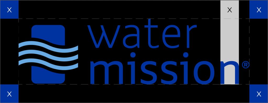
To give our logo proper room to breathe, a minimum clear space area equal to the width of the “n” in mission for maximum legibility and impact. When using the logo, no surrounding objects should enter this space. Note that more room should be allowed wherever possible.
Minimum Size
Even in the smallest contexts, our logo needs to be visible—and legible. For print, the minimum width is 1.2" x 0.55". For digital applications, it’s 124px.
Choosing the Appropriate Logo Format
Colors and Backgrounds
See below for a guide to choosing the right logo for different backgrounds. Note that the background color shown here is an example and is not built into the logo art file.
Full-Color Positive Logo (Pantone 286C and Pantone 284C)
Use on white backgrounds and over light images.
One-Color Blue Logo (Pantone 286C)
Use only on white backgrounds and with print limitations (e.g., single-color printing).
Reversed Logo
Use on black-and-white print pieces where the logo is placed over a dark grayscale image, in full-color print pieces, in digital creative where visibility of the dark blue would otherwise be compromised, or on promotional items with a colored background.
One-Color Black Logo
Use for one-color black-and-white communications such as fax and memo sheets.
Watermark Logo
Use as a monitor bug for video.Always ensure the background is light/dark enough (depending on what logo you’re using) and that the logo is easily readable.
Logo Usage
Logo Color
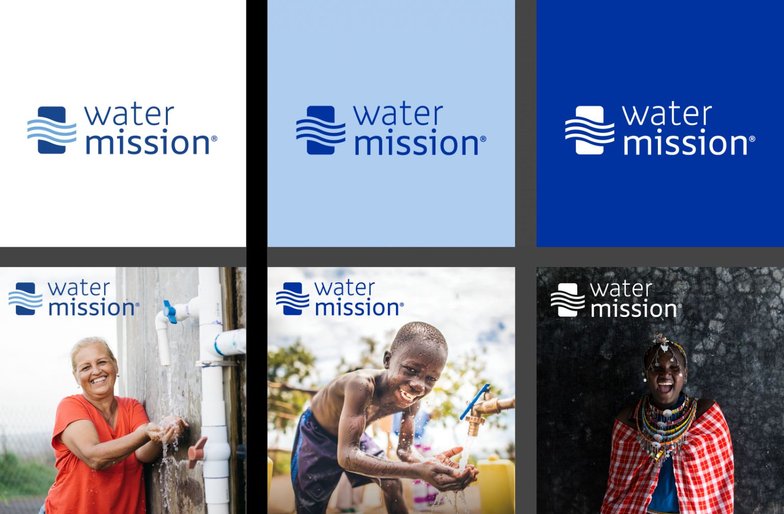
The Water Mission logo may be used in full-color (PMS 286 + PMS284), one-color (PMS 286), black, or white. As a general rule, choose the version of the logo that is most clearly visible (i.e., sufficiently contrasts with the background). For example, use the full-color logo on a white background, and use the white logo on a dark background.
When using the logo on top of an image, only use images that are not busy or distracting, and again, choose the version of the logo that is most clearly visible. Use the following examples as your guide.
Logo Do’s and Don’ts
To help us protect our brand and maintain consistency, there are clear limits on how our logo should and shouldn’t be used. Keep in mind that it’s a carefully rendered artwork. It should never be altered in any way, apart from proportional scaling. The examples on this page show some, but not all, potential ways the logo might be misused.
Do
Choose the logo colorway that provides maximum contrast over the background,
Follow clear space and minimum size rules,
Position the logo appropriately, and
Lock up with other logos correctly when needed.
Do not:
Use the wordmark without the jerrycan and/or water waves,
Change the wordmark font,
Add shadows or special effects,
Change the scale of the jerrycan and/or water waves,
Alter any of the colors in the logo, or
Alter the position of the wordmark or jerrycan and/or water waves in any way.
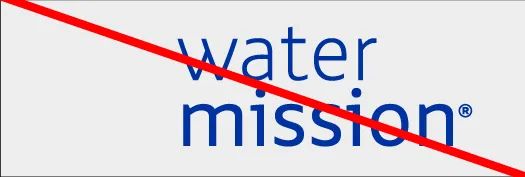
Do not use the wordmark without the jerrycan/water waves.
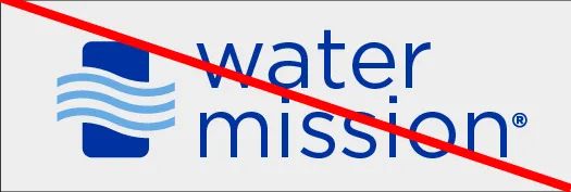
Do not change the wordmark font.
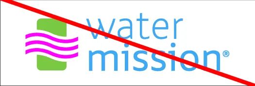
Do not alter any of the logo's colors.

Do not alter the position of the wordmark or graphic mark in any manner.
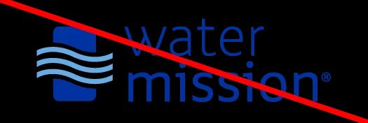
Do not add shadows or any special effects.
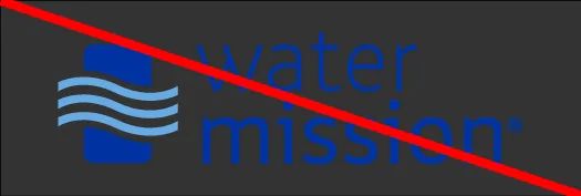
Ensure the correct logo colorway is chosen for maximum contrast on background color/imagery.
Do not change the wordmark font with a program or product name.