Signage plays an important role in clearly identifying Water Mission projects, facilities, and partners. Consistent, well-designed signage strengthens trust with communities, improves wayfinding, and reinforces Water Mission’s presence and professionalism across all project sites.
This page outlines standards for project identification signs, building and room signage, and donor or partner recognition plaques. Templates and examples are available to support easy implementation.
Signage standards are intended to provide clarity and consistency across Water Mission project sites, but they may need to be adapted based on local context. Cultural norms, government regulations, language requirements, site conditions, or material availability may influence final signage decisions. You may need to change size, orientation or layout, and that’s ok.
When adjustments are necessary, teams should prioritize:
- Clear identification of Water Mission’s involvement
- Professional, legible presentation
- Consistent logo hierarchy and brand colors
Even when modifications are required, signage should reflect Water Mission’s brand
Project identification signs are used at the main entrance or boundary of a site to clearly identify Water Mission projects to the public.
Placement
- Install outside the perimeter fence or at the primary facility entrance
- Face the main approach to the site
- Install perpendicular to roads or paths for maximum visibility
Specifications
- Recommended size: 6 ft × 4 ft (183 × 122 cm)
- Mounting height: 5–6 ft (150–180 cm) from ground level
- Orientation: Landscape format preferred
- Materials: Weather-resistant metal, powder-coated aluminum, acrylic, or outdoor-grade vinyl
Content
- Water Mission logo (first position)
- Project or system name
- Community and municipality
- Partner acknowledgments (if applicable)
- Date or year of completion (optional)
Best Practices
- Keep logo hierarchy consistent and balanced
- Avoid overcrowding text or logos
- Replace old, damaged, or weathered signage when possible
Refer to the Project Identification Sign Template for editable artwork and layout proportions.
These signs identify individual structures within a compound (e.g., Pump House) and specific rooms or areas within a facility (e.g., Chlorine Room, Storage, Office).
Placement
- Apply signage on or near entrances, centered horizontally
- Ensure visibility from primary walkways or interior approaches
Specifications
- Exterior building signs: Minimum logo width of 4 ft (122 cm)
- Interior room signs: 8 × 10 in (20 × 25 cm) recommended
- Mounting height: 5–6 ft (150–180 cm)
- Materials: Durable metal, acrylic, outdoor vinyl; laminated options may be used indoors
Content
- Water Mission logo
- Building or room name only
- Clean, high-contrast layout
Best Practices
- Maintain consistent sizing, font, and placement across the site
- Align multiple signs for visual balance
- Avoid handmade, mismatched, or low-contrast signage
Refer to the Building & Room Identification Template for editable artwork.
Recognition plaques honor the partners and donors whose support made a project possible. These should communicate gratitude while maintaining Water Mission’s brand standards.
Placement
- Mount near the main entrance or inside a primary office area
- Position at eye level for visibility and photography
Specifications
- Recommended size: 3 ft × 2 ft (91 × 61 cm), vertical orientation
- Mounting height: 5 ft (150 cm) to plaque center
- Materials: Weather-resistant metal, acrylic, brushed aluminum, or outdoor vinyl
- Background: White with Water Mission Blue accents
Content
- Project name and location
- Recognition statement
- Year of completion
- Partner and donor logos aligned horizontally and sized evenly
Best Practices
- Use official logo files only
- Do not hand-paint or redraw logos
- Maintain consistent spacing between text and logos
- Proof spelling and translations before production
Refer to the Donor & Partner Recognition Plaque Template for editable layouts.
Signage Do's and Don'ts
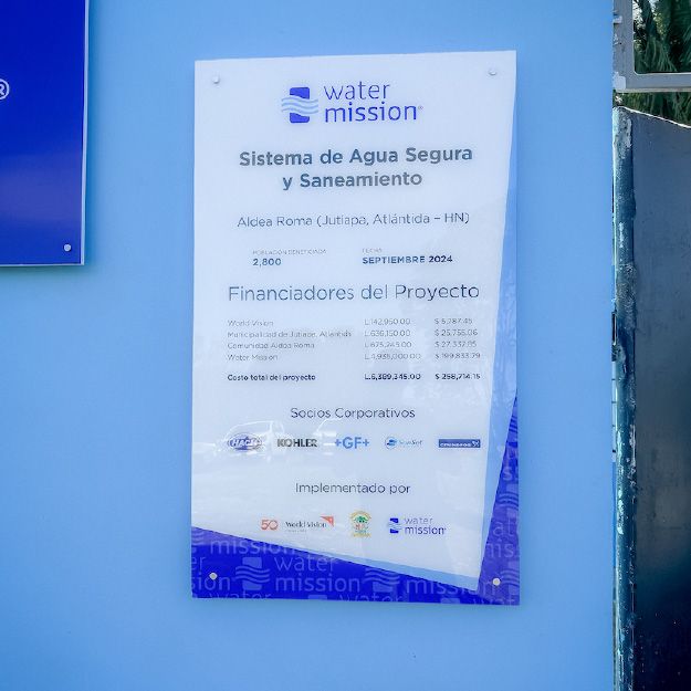
Do use clean, professional plaques with approved colors and typography
White backgrounds, Water Mission Blue accents, and official logo files create a clear, credible presentation.
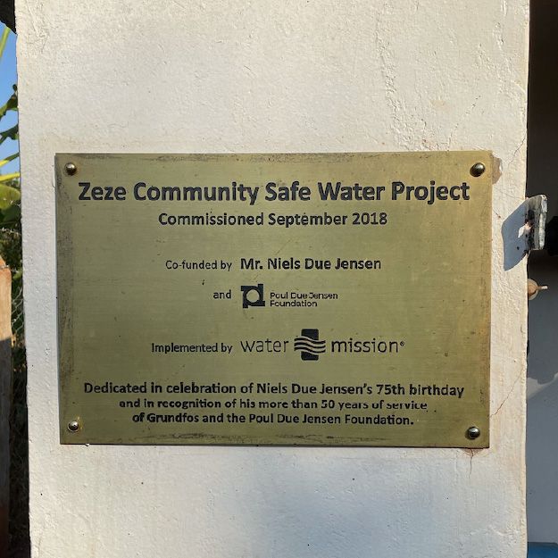
Do use standardized donor or partner recognition plaques
Follow approved layouts with consistent spacing, aligned logos, and readable hierarchy.
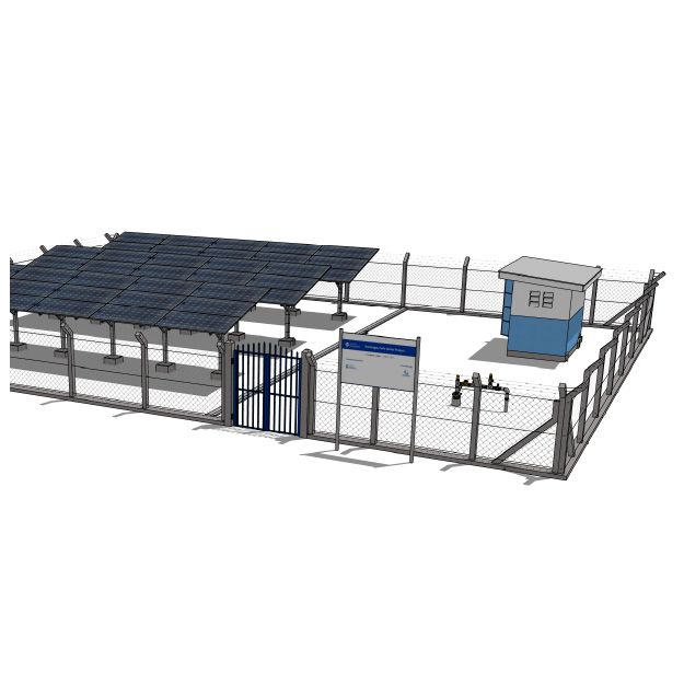
Do clearly identify project sites with branded entry signage
Signs should be visible from the main approach and use approved colors, logo placement, and layout.
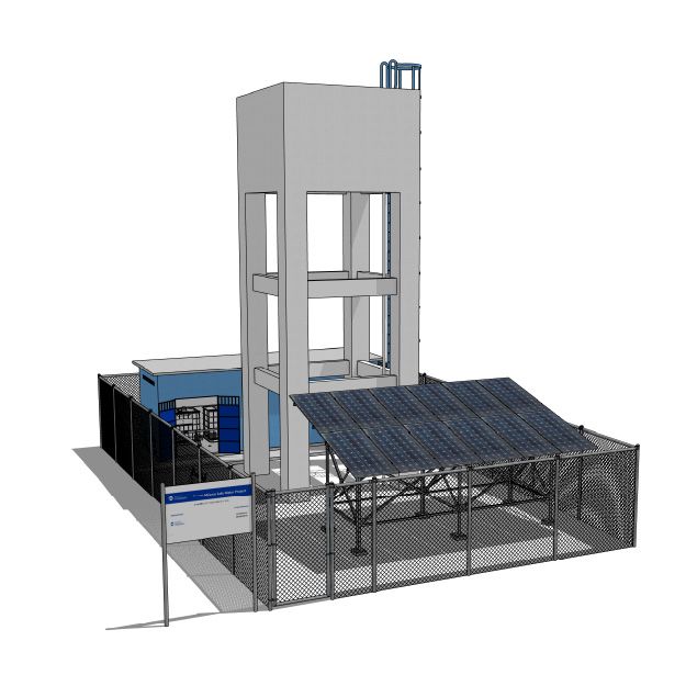
Do install project identification signs at the facility boundary or entrance
Freestanding or fence-mounted signs help clearly mark Water Mission projects in the community.
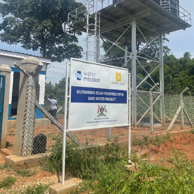
Do maintain consistent logo hierarchy when partners are included
Water Mission logo appears first, followed by partner logos at equal visual weight.
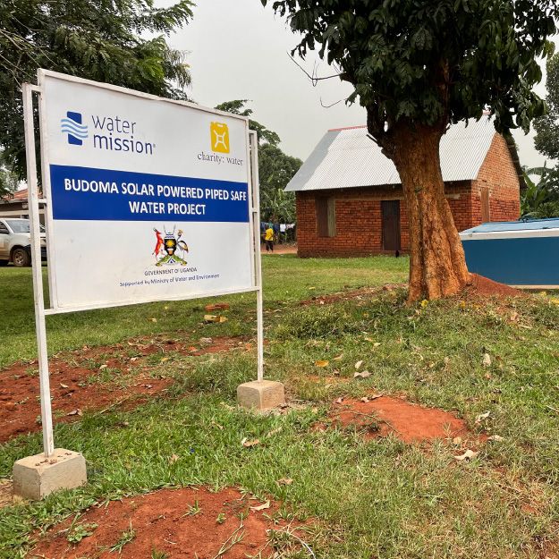
Do ensure signage is legible, durable, and well-maintained
Clean materials, high contrast, and weather-resistant finishes support long-term use.
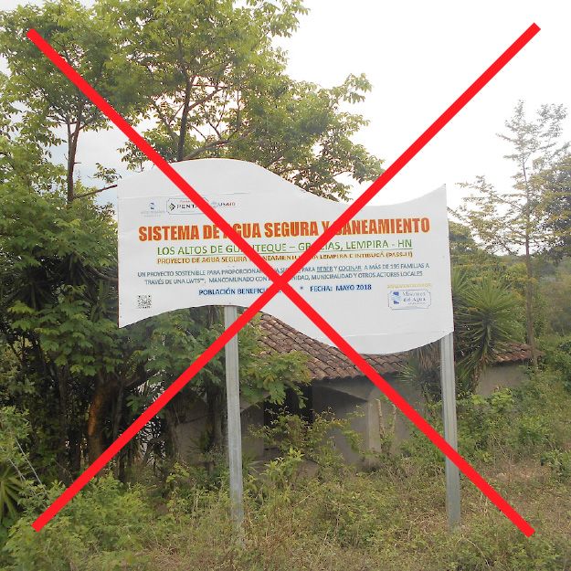
Do not mix fonts, styles, or inconsistent layouts
Avoid mismatched typography, capitalization, or ad-hoc formatting.
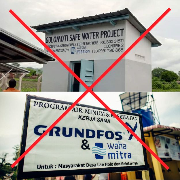
Do not free hand paint on buildings or prioritize partner logos over the Water Mission logo
Water Mission should always appear first and most prominent.
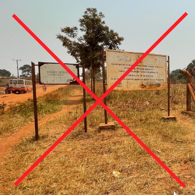
Do not install signage that is weathered, faded, or outdated partner logos over the Water Mission logo
Replace old signage to maintain a consistent and credible site appearance.
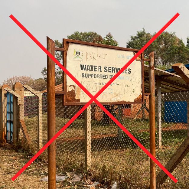
Do not rely on temporary or low-quality materials for permanent signage
Improvised signs undermine the perception of excellence and longevity.
Room and Equipment Do's and Don'ts
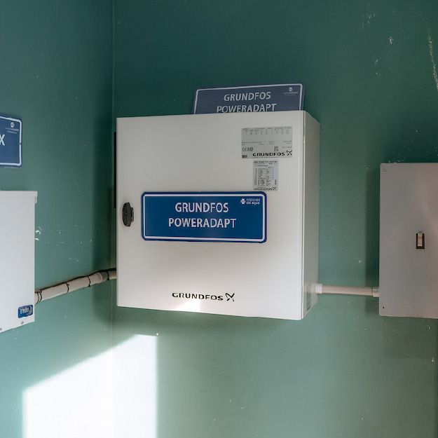
Do use clean, consistent room and equipment labels with high color contrast for easy identification.
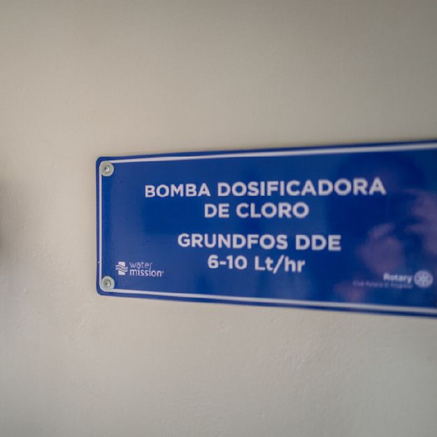
Do apply simple, legible signage directly above or near equipment and room entrances.
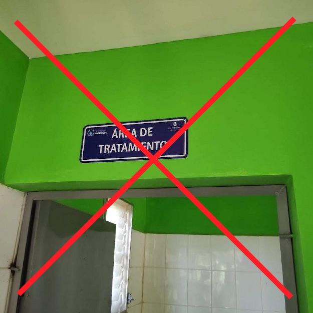
Don't use off-brand or highly saturated wall colors, handmade or inconsistent labels, or poorly placed signage that reduces readability or professionalism.
Always place the Water Mission logo first and on the left to maintain clear brand hierarchy.