This page provides guidance for applying Water Mission’s brand to buildings and structures across project sites worldwide. The goal is to promote visual consistency, professionalism, and clear brand recognition while allowing flexibility for local culture, climate, and regulations.
These standards are guidelines, not strict requirements. When local adaptation is necessary, teams should still apply Water Mission’s design principles—clean, professional, and consistent.
Building Paint
Consistent building color helps clearly identify Water Mission facilities and reinforces trust and credibility with communities, partners, and local authorities.
- Primary Brand Color: Water Mission Blue — #0033A1 | PMS 286 C
- Main exterior: White or light neutral (#F2F2F2)
- Accent or trim: Water Mission Blue on doors, trim, and/or lower third of walls
- Roof: Neutral gray or unpainted metal
- Typical ratio: Approximately 70% neutral / 30% blue
- Small buildings: 2–3 ft (60–90 cm)
- Larger structures: up to 4 ft (120 cm)
In some regions, building colors may be influenced by cultural expectations, government standards, or environmental factors. These should be honored and respected. When deviations are required, aim for a clean and consistent appearance that aligns with Water Mission’s overall brand.
- Request a Pantone PMS 286 C match whenever possible
- If PMS matching is unavailable, match to HEX #0033A1 or the closest visual equivalent
- Always request a paint swatch or sample before full application
- Use matte or eggshell finishes to minimize glare
- Avoid glossy finishes, which can darken the appearance of blue
- Document approved local paint codes and share with Engineering & Innovation for future reference
Examples (Do's and Dont's)
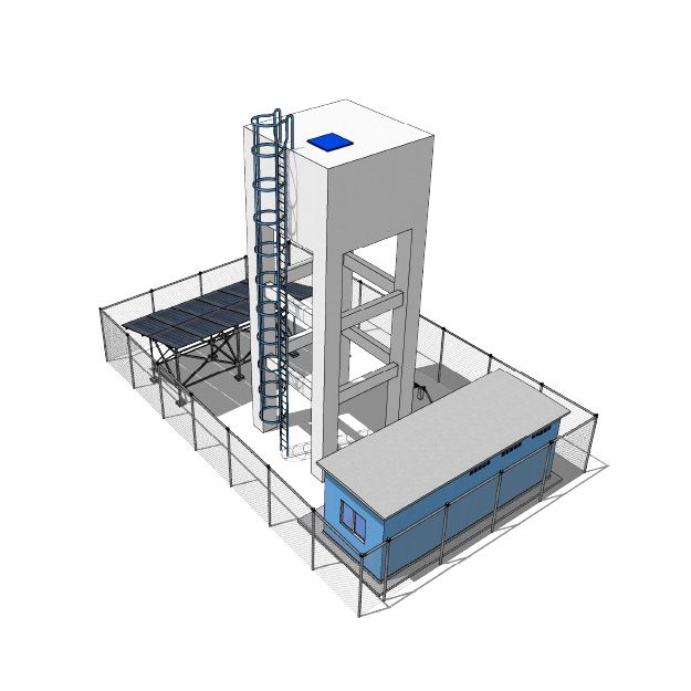
Do use consistent building color and accents
Use Water Mission Blue and neutral colors to clearly identify facilities and create a professional, cohesive appearance across the site.
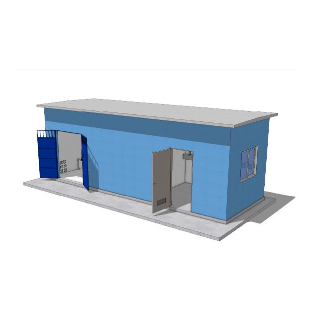
Do use clean, simple building application
Apply Water Mission Blue as an accent or primary color in a controlled, consistent way. Neutral roofs and trim help maintain clarity and durability.
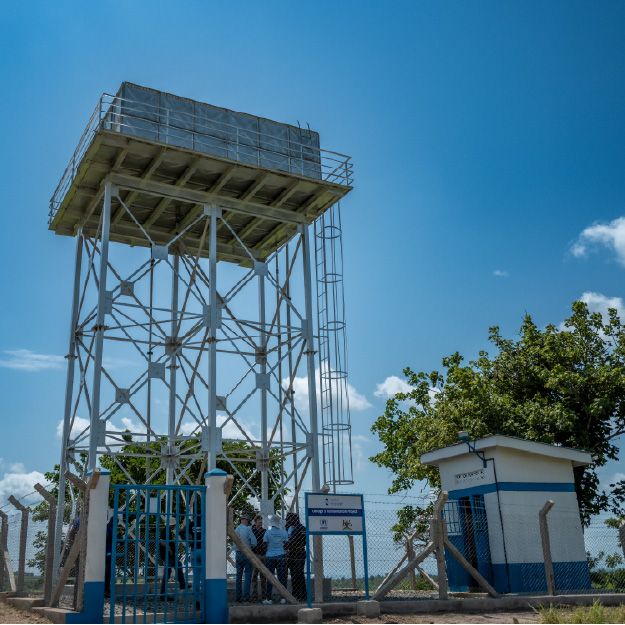
Do use on-brand building colors
Use approved Water Mission colors to maintain consistency and visibility across project sites.
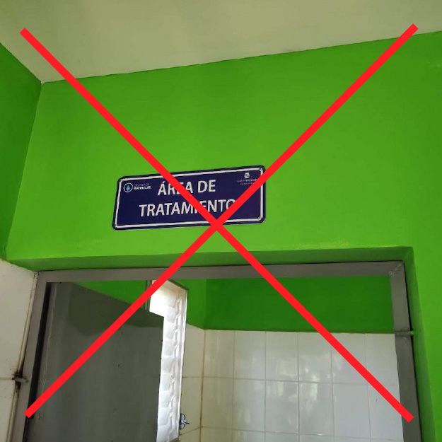
Don't use non-brand colors for buildings or signage
Avoid unapproved colors (such as bright green) that conflict with Water Mission’s brand. Off-brand colors reduce recognition and create inconsistency across projects.
Building Logo Application
Applying the Water Mission logo correctly on buildings protects brand integrity and ensures long-term consistency across global projects.
Logos should be installed on buildings using one of the following approved approaches:
- Prefabricated signage
- Metal, acrylic, or high-quality outdoor vinyl
- Mounted directly to the building or on a fixed frame
- Stencil application
- Use the official Water Mission logo stencil available on the Brand Site
- Trace or paint the logo using the stencil only
Do not freehand paint the Water Mission logo.
- Freehand painting alters official logo proportions
- Hand-painted logos often stretch, skew, or distort
- Inconsistent execution weakens brand recognition
- Use official logo files only
- Do not redraw, modify, or add country names to the logo
- Use the stacked logo when space is limited
- Use the horizontal logo when space allows
- Ensure sufficient clear space around the logo
Examples (Do's and Dont's)
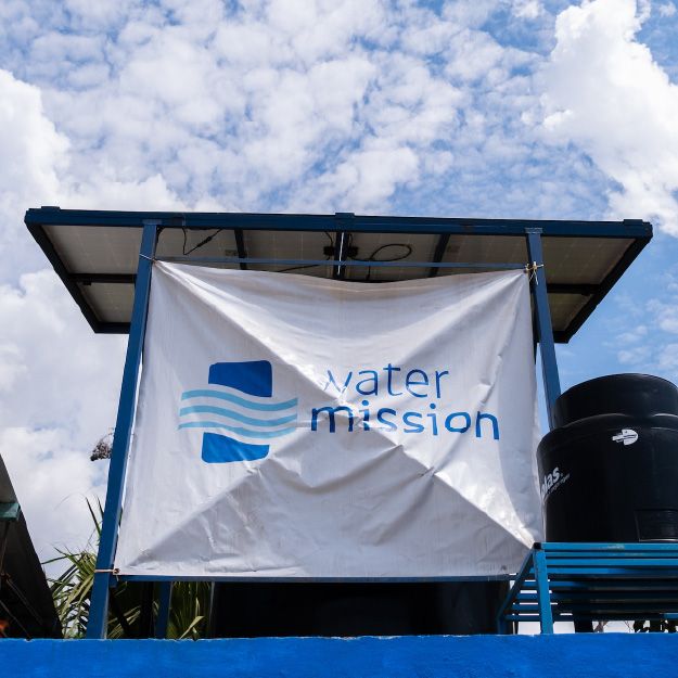
Do use consistent building color and accents
Use Water Mission Blue and neutral colors to clearly identify facilities and create a professional, cohesive appearance across the site.
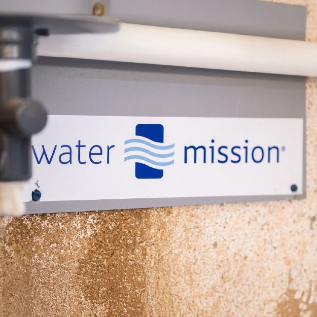
Do use clean, simple building application
Apply Water Mission Blue as an accent or primary color in a controlled, consistent way. Neutral roofs and trim help maintain clarity and durability.
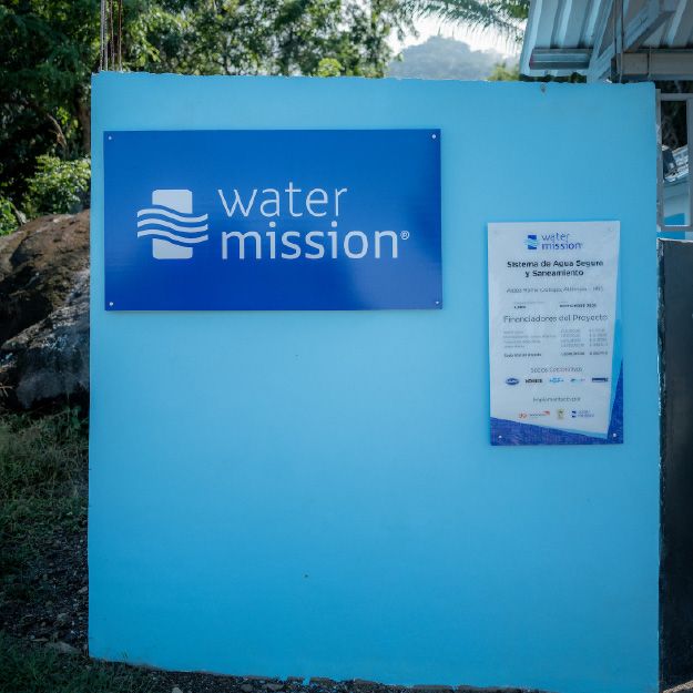
Do use on-brand building colors
Use approved Water Mission colors to maintain consistency and visibility across project sites.
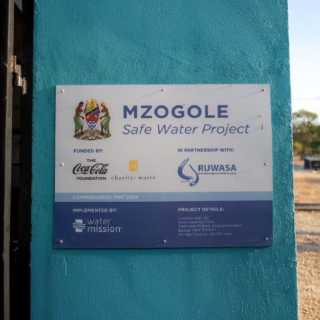
Do use the official Water Mission logo as provided
Always use approved logo files or stencils to ensure consistent proportions, spacing, and legibility.
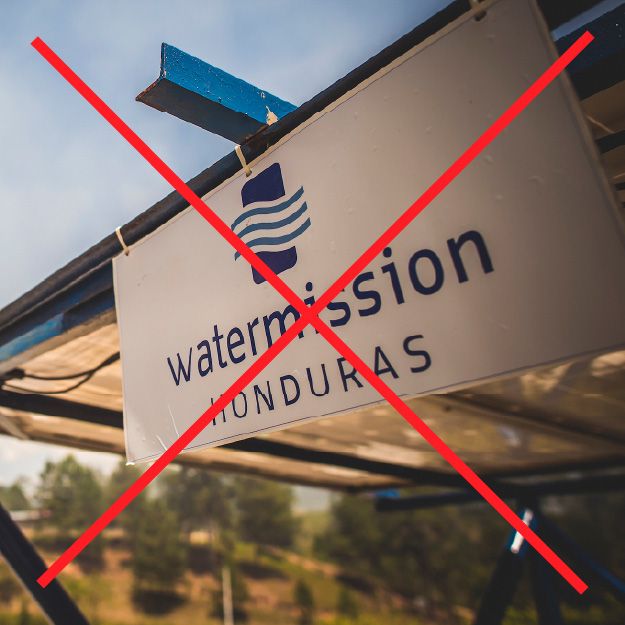
Do not add country or program names to the logo
The Water Mission logo should never be modified to include country names, locations, or additional text.
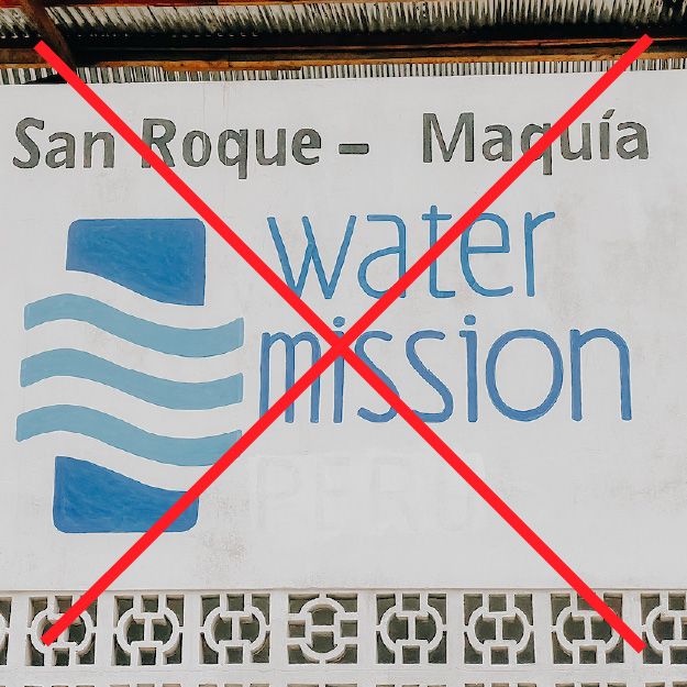
Do not redraw or hand-draw the logo
Hand-drawn or freehand logos distort proportions and weaken brand recognition.
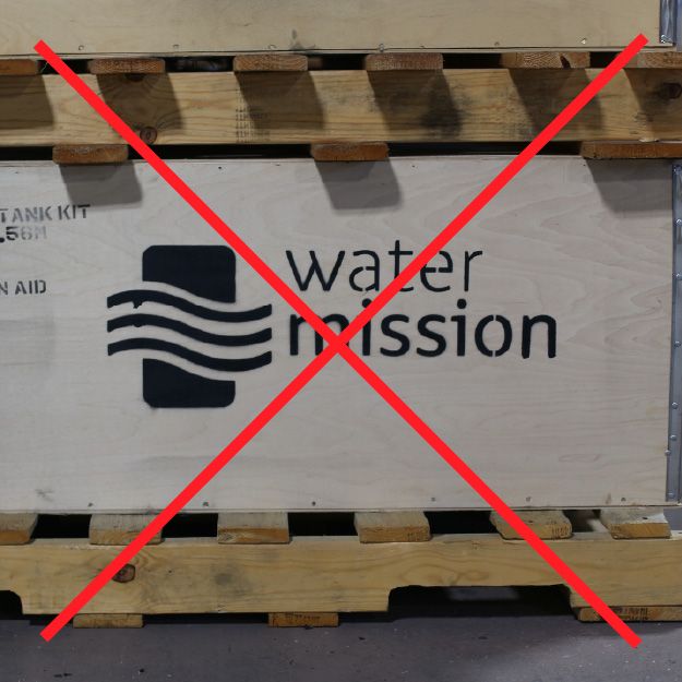
Do not alter logo proportions or spacing
Avoid stretching, compressing, or crowding the logo to fit a space.
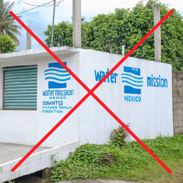
Do not paint logos freehand on buildings
Freehand painting results in inconsistent shapes and is considered altering the logo. Use approved stencils only.