Primary Brand Colors
In the field, a Water Mission T-shirt is often greeted with smiles of relief, joy, and hope. Water Mission blue is the color of hope. It has become synonymous with who we are as a brand. Like our staff, it conveys love, excellence, and integrity—symbols of progress and a better future. Use this color openly and without shyness.
Alongside blue, our visual anchor and differentiator, the colors of light blue, white, and black play supporting roles to bring balance and contrast.
Core
Our core brand colors are used across all communications for maximum association with the Water Mission brand.
Each of the core colors can be used as a solid fill background or as a highlight color. Only use color combinations that provide clear contrast and legibility of overlaid text and graphics.
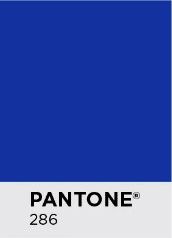
CMYK 100/75/3/0
RGB 0/51/161
HEX 0033a1
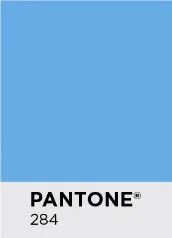
CMYK 55/22/0/0
RGB 106/170/228
HEX 6aaae4
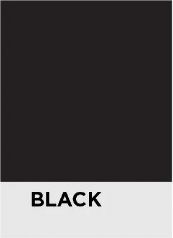
CMYK 0/0/0/100
RGB 0/0/0
HEX 000000

CMYK 0/0/0/0
RGB 255/255/255
HEX ffffff
Secondary Supporting Palette
This secondary color palette may be used to support the core brand colors. These colors are to be used only as needed to advance the visual narrative, communicate information more clearly, or provide boldness and/or warmth that complements the main color usage.
Guidelines
Secondary colors must always play a supporting role to the primary brand colors—never replace them. They must never account for more than 20% of color on any single page, piece, or visual. It's also wise to remember and understand that there are other NGOs in our sector that own their own brand colors, such as yellow and orange. Use these two secondary colors with caution.
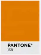
CMYK 10/60/99/1
RGB 222/125/39
HEX de7d27
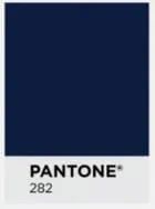
CMYK 100/87/42/52
RGB 1/30/65
HEX 011e41
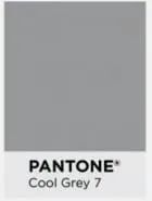
CMYK 43/35/35/1
RGB 151/152/154
HEX 97989a
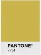
CMYK 23/24/85/0
RGB 202/180/75
HEX cab44b
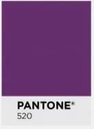
CMYK 69/95/27/14
RGB 101/47/108
HEX 652f6c
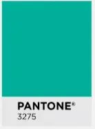
CMYK 100/0/54/0
RGB 0/175/154
HEX 00af9a
Contrast With Color: Design Considerations
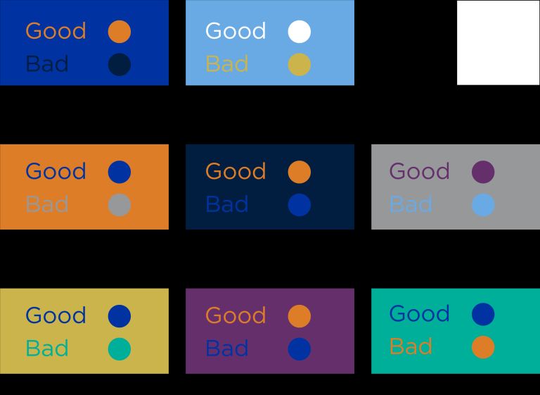
Applications in which secondary colors may be useful include charts, graphs, sector designations, and project collateral. The following helps illustrate better color combinations that enhance contrast and readability for all audiences when incorporated into design.
Text Color
Our standard text colors for headings, sub-headings, labels, and captions are black, white, and at times, dark blue. These two shades and one color help enhance the contrast of text in our print and digital design. The Water Mission creative team may use other secondary colors for text as appropriate.
Proper design will also help our audience with visual impairments. According to the ADA, "sufficient color contrast between the text and the background allows people with limited vision or color blindness to read text that uses color.”
The following are examples of acceptable text color contrast:
For Position Only (FPO)
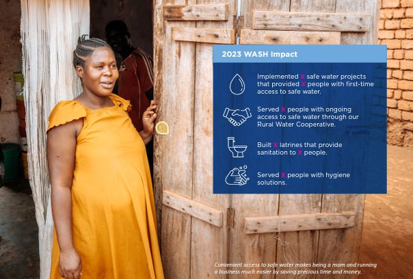
Design best practice is to use the color magenta for any placeholder text in place for position only, known as "FPO." Here is an example of using magenta and the letter "x" to indicate FPO in a design proof:
