Creative Principles
These creative principles have been developed to connect with our audiences in a way that always feels like the organization. We use these principles across all of our communications, internal and external. But depending on the audience and the media we’re using, we can focus more on specific principles. Our creative principles are flexible, yet highly effective in achieving consistency.
Logo
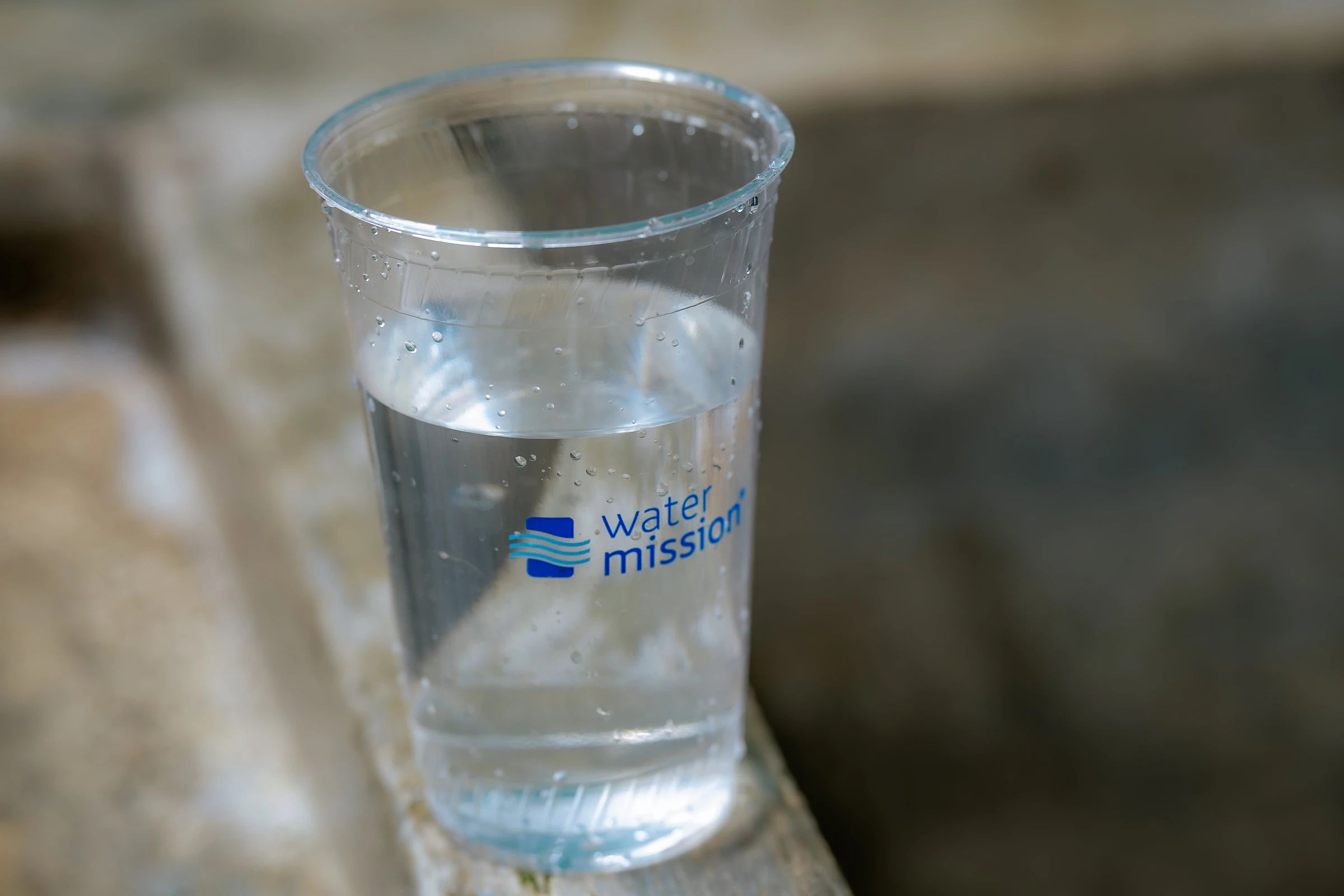
Our logo symbolizes hope, and it represents who we are as an organization. Water Mission has only one logo. No other logo or graphic mark may be used to advertise, market, or communicate Water Mission’s brand, products, or projects. Although there are other Water Mission visual identity elements, the logo is an important visual element that communicates who we are.
Colors
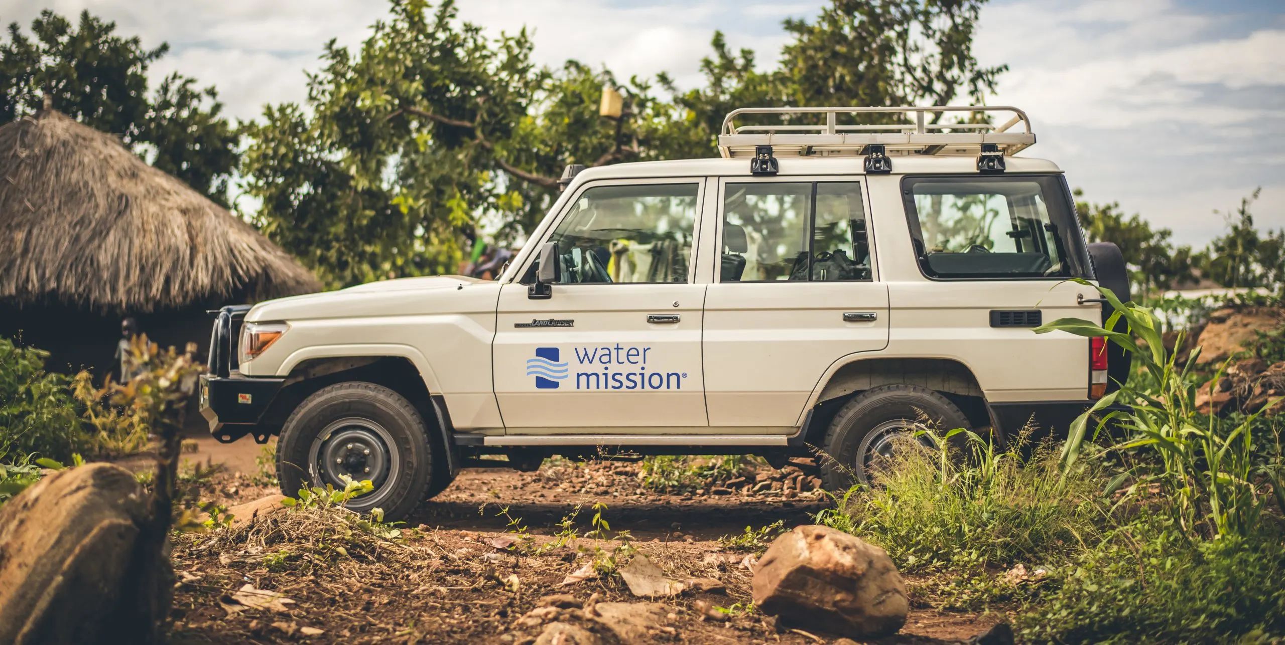
In the field, a Water Mission T-shirt is often greeted with smiles of relief, joy, and hope. Water Mission blue is the color of hope. It has become synonymous with who we are as a brand. Like our staff, it conveys love, excellence, and integrity—symbols of progress and a better future. Use this color openly and without shyness.
Typography
Water Mission’s typography uses Calibri for internal and long-form content and Gotham for marketing and collateral. Gotham’s range of weights supports headlines, subheads, and body copy, while standards for font size, leading, and kerning ensure readability and consistency. These guidelines help maintain a clear and professional visual identity across all communications.
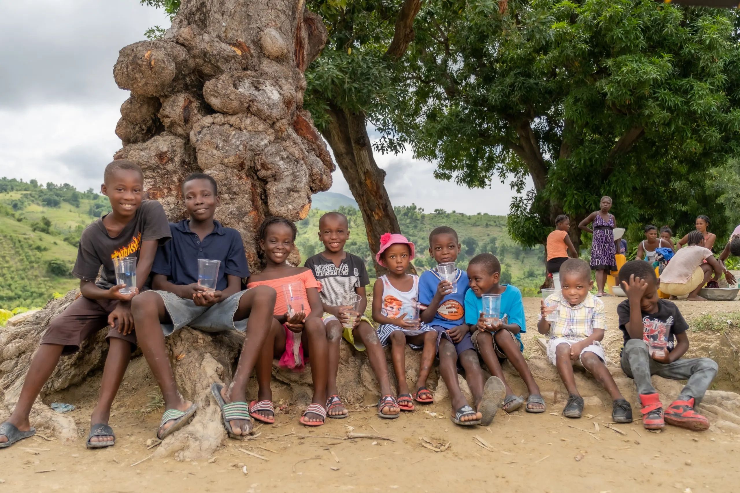
Photo and Video
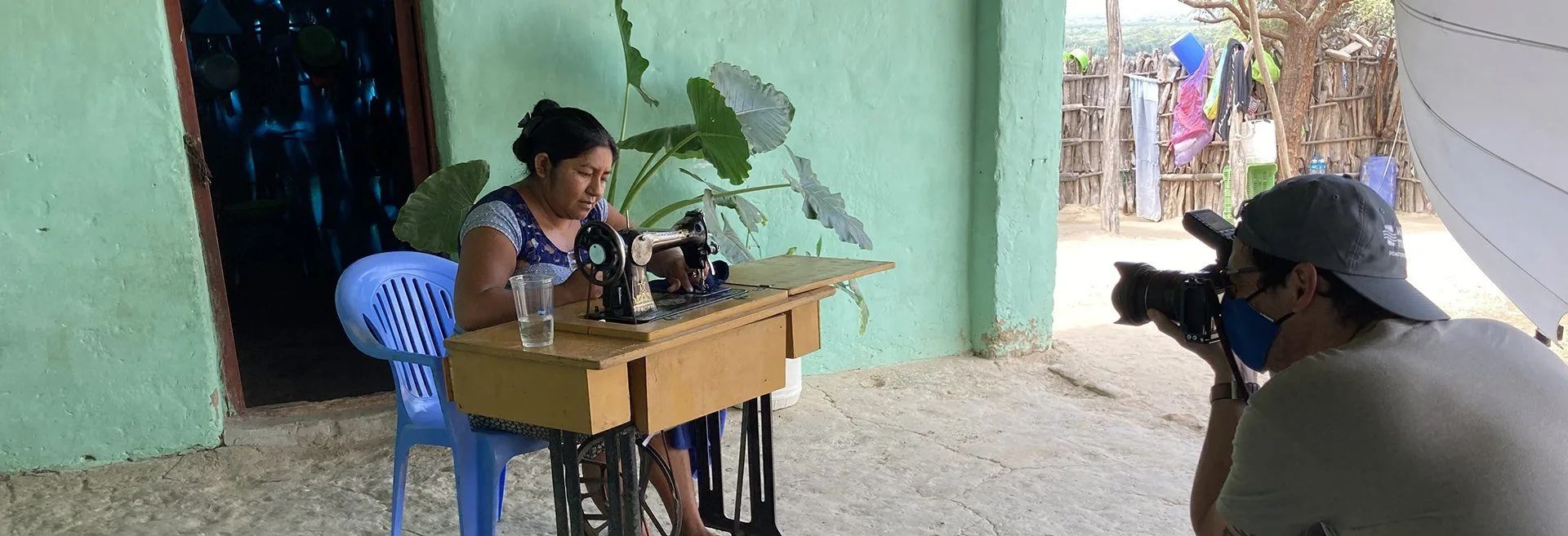
Many of our marketing materials are built around images provided by Water Mission staff or professional photographers. Use our creative principles—create movement, have focus, be real—as guidance in selecting the most brand-supportive images to use in any communications. These creative principles should also be used while capturing photos and videos for Water Mission.
Water Builds
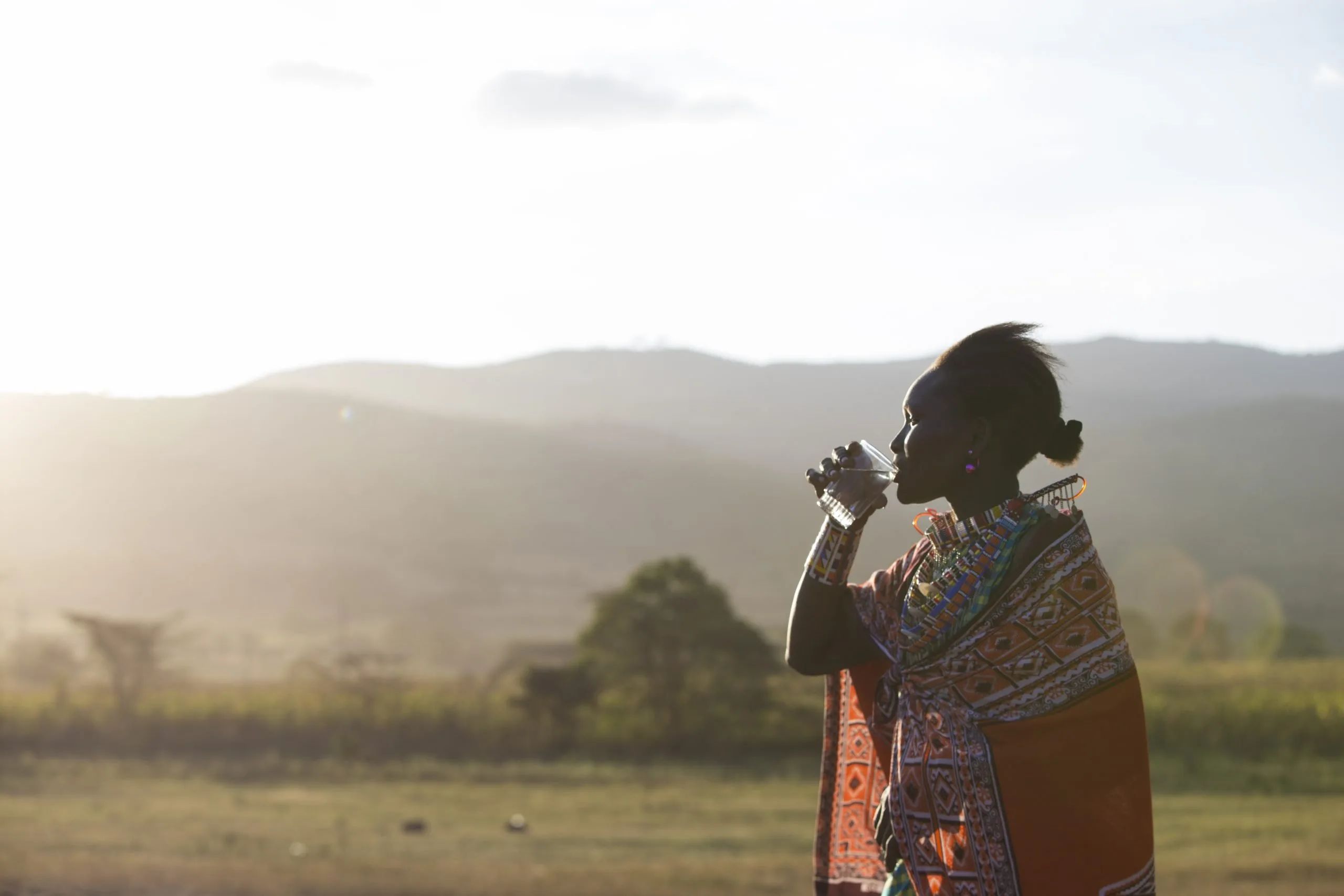
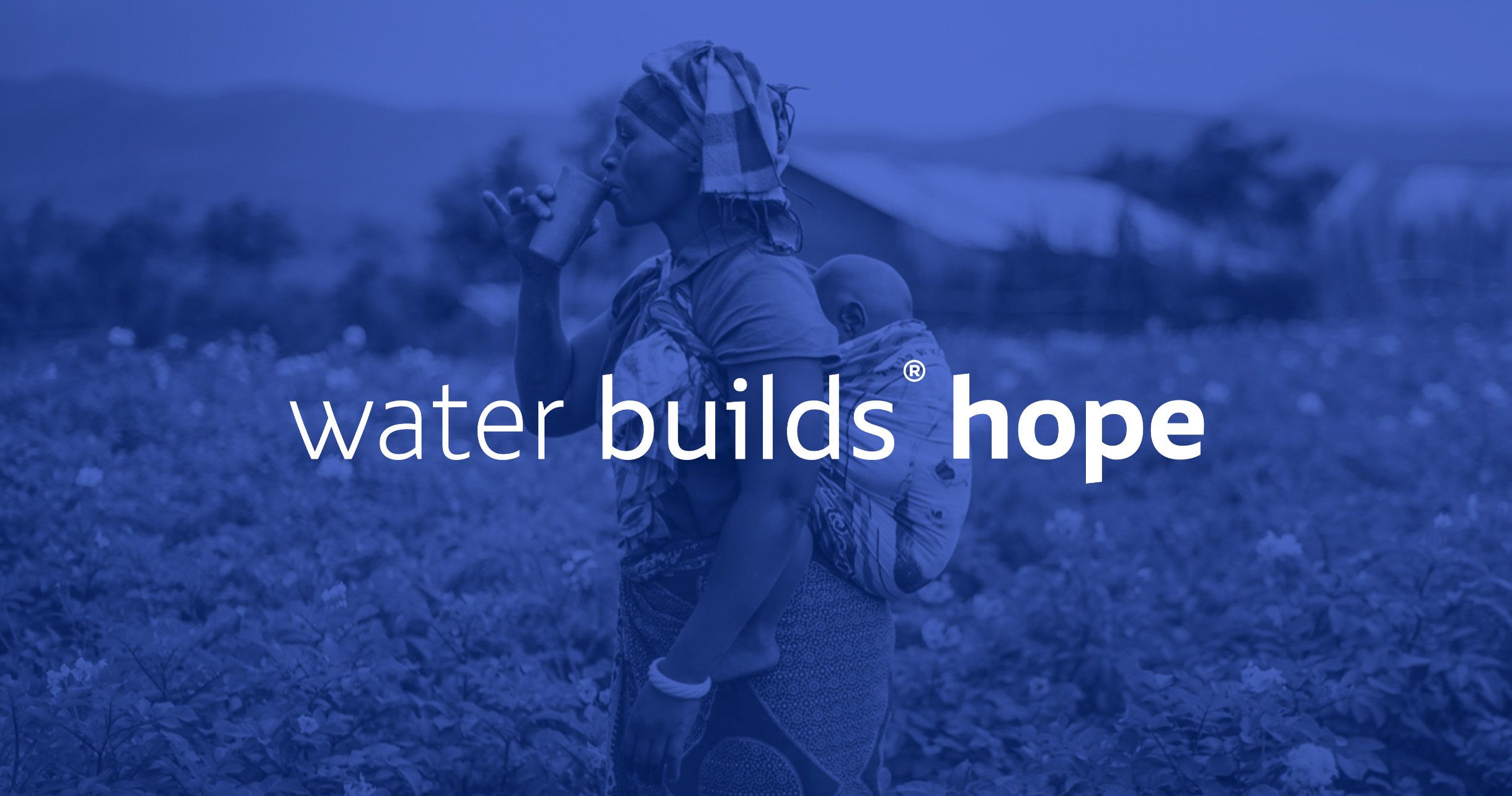
At Water Mission, we understand the importance of safe water. It’s the foundation of life. We believe that water can build a better life, provide hope, and bring joy. The water builds® slogan is a registered trademark and extends the Water Mission brand. It allows us to briefly communicate what safe water means to people once lacked access and now have safe water.
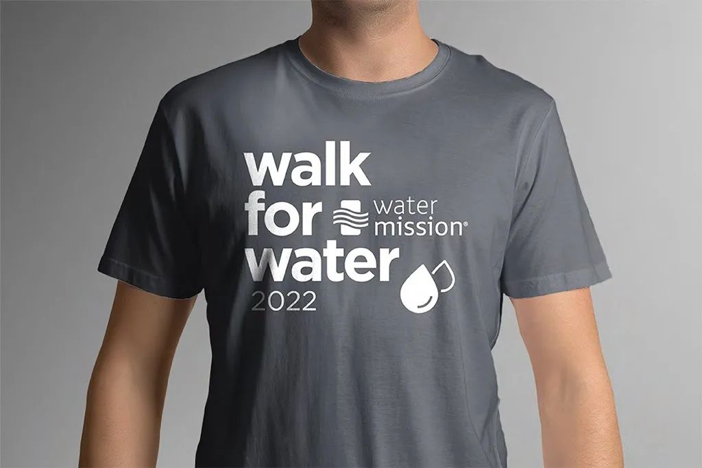
Walk for Water
As a “signature” engagement event for Water Mission, the annual event is considered a core brand offering of the organization. Because of this, the Walk for Water program is identified with a unique visual identity created to consistently market to all audiences across all Walk events—from the flagship event in North Charleston to partner and regional Walks around the United States and beyond.
