Water Mission’s brand architecture defines the structure of our core brand offerings (outlined below) and how each of these pieces relates to each other and the central, parent brand.
Our brand architecture is a branded house, in that every brand element (from names to visuals) points back to our central parent brand. This structure strategically places the Water Mission brand at the center and most visible part of everything we produce to bring about maximum awareness and visibility with our audiences in the marketplace.
Our brand architecture is instrumental in helping our external audiences navigate our brand and to enhance their perception of our organization.
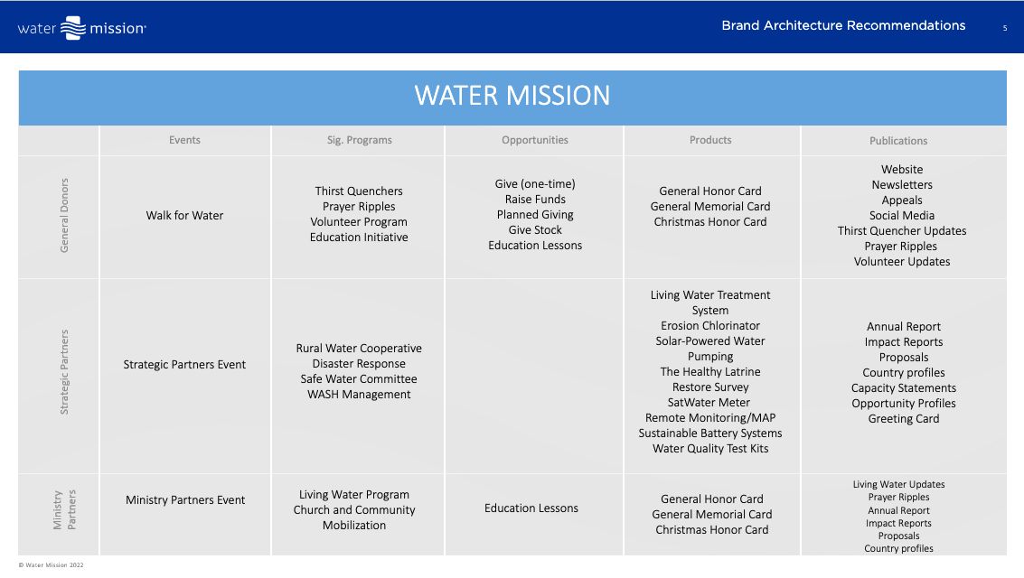
The central parent brand is Water Mission. The parent brand influences all visual and verbal elements, thus there are no sub-brands within the Water Mission brand. The parent brand is comprised of several different brand offerings, each with a unique purpose and audience. We categorize our core brand offerings as follows:
Events
Signature Programs
Opportunities
Products
Publications
The following matrix illustrates how the brand offerings are grouped by category and audience.

Guiding Principles
For all new brand offerings created within the organizations, the following are principles used to help create names and visual identities.
Naming Guidelines
Convey the meaning and purpose of the brand offering
Names will be more literal, less conceptual/creative
We want to avoid acronyms and creative or unique names that may be confusing or require more explanation and resources to educate the audience.
Avoid sounding too similar with other brand offerings to minimize confusion
Consideration of compliance with cultural and language nuances
Availability of trademark, SEO, and other considerations
Consideration of the variety of usage contexts
Visual Identity Guidelines
Align with parent brand visual identity
Priority brand offerings (e.g. Thirst Quenchers, Prayer Ripples, Living Water Treatment System, etc.) may be presented visually using the parent brand font Smidswater.
Ability to stand alone as needed
No unique graphics, only text.
Please read more about our visual identity and creative principles.